Multimedia Tools
Content and the way it is presented on a website is what can make or break it. The content of a website has been compared to a cupcake: the actual text is like the cake and the multimedia elements are like the frosting (Sniderman, 2010). Both are needed to satisfy an audience. While the text of a website can relay major information to the reader, multimedia in the form of audio, photos, videos, slideshows, or additional links, keep the reader engaged and coming back for more. Depending on the content of the site, certain multimedia elements may work and others may not. The important thing to remember is that your multimedia elements should support what you are trying to convey to your audience and should not distract them from it. Every audience member learns differently, so multimedia allows a content producer to provide both textual and visual elements to deliver their message. For those audience members who understand information by reading about it, the textual elements will work well. For audience members who like to see for themselves how things are done or how something happened, video, pictures and slideshows will be effective.
The article "Snow Fall: The Avalanche at Tunnel Creek," which was published on NYTimes.com, was a multimedia feature that not only provided in-depth text describing the event, but provided pictures, videos, time-lapses, maps and animation of how the event transpired. I was reading the piece in 80 degree weather and I felt like I was actually on the mountain with the group. Visuals of the mountain itself and snow falling, along with pictures of the group and videos of the survivors, made the story come alive. Not only was I reading about the tragedy, but I felt like I was experiencing it with them. That is what an audience is looking for when they view a website or a blog. Not only do they want to understand the information being presented, but they want to be entertained. Multimedia keeps an audience engaged and focused. Without the visuals for this story I think the audience would have stopped reading a quarter of the way through. The story was incredibly interesting, but because it was a feature piece it was quite long and without the images and interviews I think the audience would have gotten bored and moved onto something else.
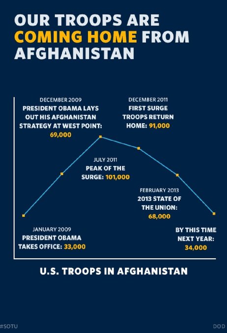
During President Obama's 2013 State of the Union address, his team launched a multimedia presentation that coincided with his speech that included 107 slide and 27 charts. While the multimedia presented the information "simply, clearly and honestly," some of the charts were misleading because of the way they were designed (NPR, 2013). This chart depicting the amount of U.S. troops in Afghanistan, for example, has no labels on either axis, and the time that passes between each point on the chart is not equal, yet the space between the points makes it look that way. It also pinpoints on the chart a future number that may or may not actually happen. This can be misleading. There were multiple other charts that had similar problems. The moral of the story is that if an individual is going to utilize multimedia elements, they have to be sure that even if the information presented is accurate, that it is not misleading the audience just to support your conclusion. In this case, although the information presented was accurate, it was misleading, and did not necessarily do the job it was meant to do.
Multimedia should support and add to the information that is presented in text form. Multimedia keeps the audience engaged and gives people who learn better through visuals the ability to take in the information as successfully as those who are more comfortable with viewing information in text form. The subject of the particular website or blog will ultimately dictate which multimedia will best enhance the information being relayed.
Resources
Branch, J. (2012, December ). Snow fall: The avalanche at tunnel creek.The New York Times. Retrieved from http://www.nytimes.com/projects/2012/snow-fall/?_r=0#/?part=tunnel-creek
NPR Staff. (2013, Feb. 14). Chart check: Did obama's graphics 'enhance' his big speech? NPR. Retrieved from http://www.npr.org/blogs/itsallpolitics/2013/02/13/171935151/chart-check-did-obama-s-graphics-enhance-his-big-speech
Sniderman, Z. (2010, July 28). How to: Add Multimedia to your blog. Mashable. Retrieved from http://mashable.com/2010/07/28/add-multimedia-to-blog/
Sam,
ReplyDeleteGood point on the timeline aspect. Visual aids are great for statistics but what about the timelines? We've seen them in textbooks to help provide context for the reader in a dimensional concept such as time - but what if the timeline is incomplete or misleading? Great catch!
Thanks,
Emily
I love the Times article. Do you imagine there will be more of this kind of multimedia story telling ad people get used to the e-books and other ways of telling stories.
ReplyDelete